


| 제목 | Samsung Galaxy S5 Gold Hands on | 추천 | 0 | IP 주소 | |
|---|---|---|---|---|---|
| 글쓴이 | UnderKG | 날짜 | 2014.04.10 21:58 | 조회 수 | 159155 |
|
|
|||||
댓글 57
-
galaxynote3
2014.04.10 22:33 [*.19.xxx.227]
데일밴드? 와 골드 진짜 못뽑았네요 -
Vex
2014.04.10 22:33 [*.224.xxx.56]
으아아아 혐짤 -
Vex
2014.04.10 22:34 [*.224.xxx.56]
유광이라 더 혐짤 -
UnderKG
2014.04.10 22:36
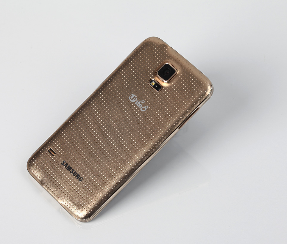
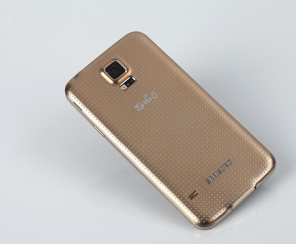
조명 상태에서 사진찍기가 힘들어서, 정확한 색상은 매장에서 보시는게 가장 정확할거 같습니다. 맨 마지막 사진이 그나마 실제 색상에 가장 가까운거 같습니다. -
헬지탈출넘버원
2014.04.10 22:38 [*.126.xxx.176]
궁금한게 있습니다. 저 추노마크는 절대 지울 수 없는건가요?? -
UnderKG
2014.04.10 22:39
U+ 에 문의를 부탁드립니다. -
헬지탈출넘버원
2014.04.10 22:43 [*.126.xxx.176]
지울 수 없다는건 이미 알고있습니다ㅜㅠ 플라스틱 일지언정 갤노트3 처럼 고급스런 느낌을 줄 수있는 반면에 갤스파의 골드는 노트3의 플라스틱에 아이폰5s 의 색을 흉내낸 느낌이네요. -
Vex
2014.04.10 22:43 [*.224.xxx.56]
밴드를 붙이심이?추천:1 댓글
-
헬지탈출넘버원
2014.04.10 22:45 [*.126.xxx.176]
ㅋㅋㅋㅋㅋㅋㅋㅋㅋㅋㅋㅋ최고의 아이디어입니다! -
ART
2014.04.10 22:40 [*.62.xxx.1]
옆면은 그냥그런데 뒷면은 lte8로고와 환상적인 콜라보레이션........ -
EGOISTchelly
2014.04.10 22:43 [*.70.xxx.44]
뒷면은 진짜 최악인데 앞면만 보면 화이트보다 훨씬 낫네요
화이트는 진짜 최악인듯 -
기동전사건담
2014.04.10 22:44 [*.209.xxx.92]
마지막 영상 멋지네요 ㅋㅋ 열정이 넘칩니다 보기 아주 좋고 팬입장에서 뭔가 흐믓하네요 -
송해손잡고
2014.04.10 22:47 [*.195.xxx.74]
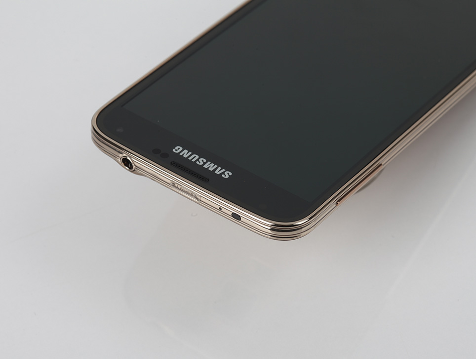
화이트랑 홈버튼 크기가 달라보이는데 실제로도 다른건가요? -
june
2014.04.10 22:48 [*.150.xxx.39]
어라운드 뷰가 추가된 건가요?? -
UnderKG
2014.04.10 22:49
아직 아닙니다~ -
쟈칼
2014.04.10 23:11
어라운드뷰는 테스트 중입니다. 정식으로는 아마도 이달말부터 될꺼같네요 -
UMADBRO
2014.04.10 23:04 [*.178.xxx.193]
Lte 8이......솔직히 저게 제일 못생겼어요
요약하면 그냥 8이 아니라 ㅅ... -
사나칸
2014.04.10 23:07 [*.169.xxx.86]
이건 또 뭔가요??
앜ㅋㅋㅋㅋ -
여하튼
2014.04.10 23:22 [*.96.xxx.189]
칠해진 금색이 그리 못나진 않았다고 생각하지만, 모공이 없으면 지금보다 15억배 나았을 듯
그래도 이 영상 보니까 화이트보다 골드가 나아보이네요 저는? ㅋㅋ -
youngnam5
2014.04.10 23:23 [*.45.xxx.185]
뭐 얼마나 이상하겠...응?
디쟌은 개취라지만 뒷면에서 빵 터졌네요 실물은 좀 낫겠죠?;;;
갤럭시 J는 좀 예쁘다던데 흠...
발빠른 리뷰 보고 항상 많은 정보 얻어갑니다^^ -
멀가중멀가중멀중가중
2014.04.10 23:24 [*.102.xxx.222]
뭔가 메세지가 담긴 개봉기 같네요. -
iAfter
2014.04.10 23:34 [*.183.xxx.178]
ㅎㅎ... 너무 명품디자인이라 싼 느낌의 골드를 칠한걸까요... 물론 제가 골드를 볼줄 몰라서 그러겠지만.....ㅎㅎ.... 참... -
P17ture
2014.04.10 23:56 [*.104.xxx.200]
what da.. 보너스영상의 구도는 정말 좋은데 치명적인 디자인은 어쩔수가 없는건가 보군요.. 아무리 각도를 잘뽑아내도 별로라는 느낌은 여전하네요.. 화이트가 그나마 볼만하고 -
sbryu
2014.04.10 23:57 [*.71.xxx.24]
끝에 음악이랑 폰이랑 잘 어울리는거 보니까 촌스럽다는걸 표현하는거같네요 ㅋㅋㅋㅋㅋㅋㅋㅋㅋ -
kreuznach
2014.04.11 00:01 [*.118.xxx.224]
하;;; 정말; 락카스프레이로 대충 찍찍 뿌려놓은거 같이 생겼네요.. lte8까지 최악의 미친 시너지 ㅋㅋㅋㅋㅋㅋ -
울트라빅슈
2014.04.11 00:24 [*.143.xxx.4]
와.... 진짜 취향은 존중해야하는거지만....
대체 이거 누구 취향이라고 만든걸까요[...] -
싱댕
2014.04.11 01:13 [*.255.xxx.87]
아 맙소사다 정말 ㅋㅋㅋㅋㅋ 일단 댓글, 이제 볼까요~ -
Onestar
2014.04.11 01:19 [*.162.xxx.48]
영상 마지막에 갑자기 클로즈업될때 식겁했음 ㅋㅋ 으아아아 내눈!! -
papageno
2014.04.11 01:52 [*.206.xxx.154]
반전이 있을줄 알았는데 없다. ㅜㅜ -
고라니
2014.04.11 01:53 [*.229.xxx.161]
블랙 커버로 바꾸면 그나마 테두리만 금색이라 괜츈을거같은데 ㅋㅋ -
undergram
2014.04.11 06:14 [*.200.xxx.213]
헬지 엘티28 진짜 혐짤... -
sleney
2014.04.11 06:52 [*.225.xxx.240]
8과 대일밴드와 콜라보레이션...... -
프로덕트
2014.04.11 09:28 [*.145.xxx.160]
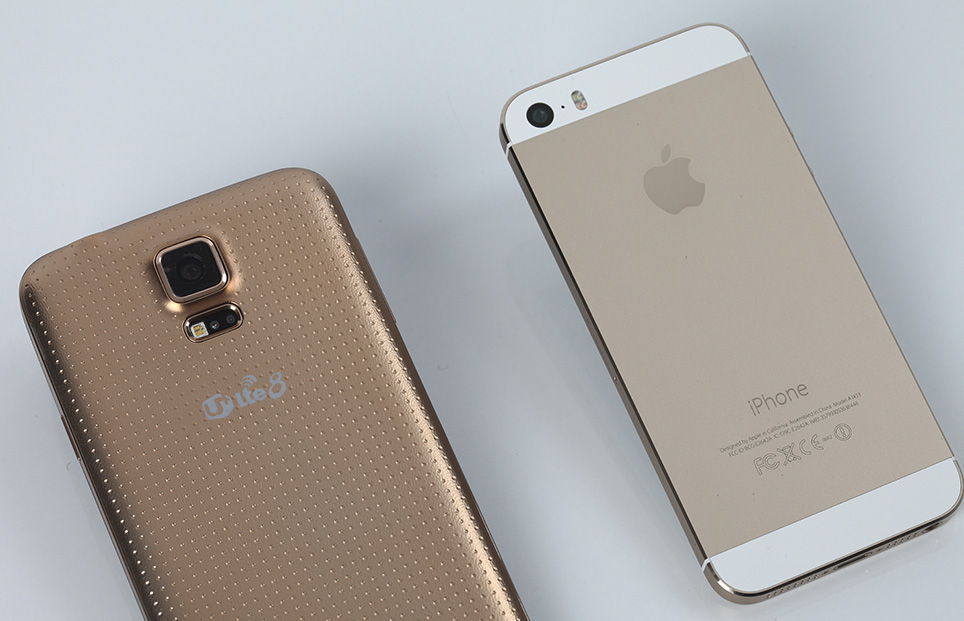
옆에 아이폰 놓고 비교하시면....... 충격적인 비쥬얼이 더욱 두드러집니다 ㄷㄷ;; -
클라우스
2014.04.11 09:55 [*.78.xxx.202]
저도 차마 저 뒷면 못봐주겠네요 ㄷㄷ;; -
라이언
2014.04.11 11:19 [*.37.xxx.60]
흐음...;;; -
행불7시간그네
2014.04.11 12:43 [*.223.xxx.52]
골드는 제대로 밴드네요 ㅎㅎ -
깨비1
2014.04.11 13:23 [*.62.xxx.19]
제도5000 ... -
Julia
2014.04.11 14:11 [*.170.xxx.2]
전 개인적으로 구멍숭숭난 무늬보다는 전체 디자인이 마음에 안드는 거 같아요. 그리고 골드는 정말 순황금덩어리처럼 느껴지게 만들었네요..ㅠㅠ 게다가 U+ 로고까지..ㅠ -
Cenez
2014.04.11 15:13 [*.124.xxx.185]
이건 별도의 리뷰가 없나요? -
UnderKG
2014.04.11 21:21
별도의 리뷰는 없습니다. -
스티브잡스
2014.04.11 15:26 [*.196.xxx.180]
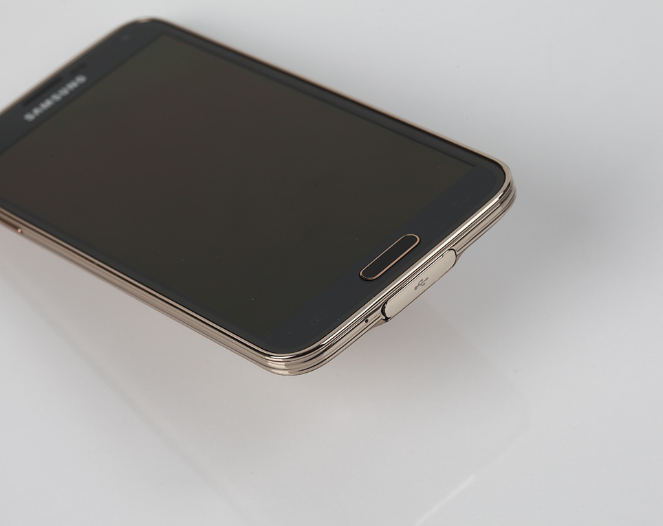
그와중에 홈버튼 테두리는 또 금으로 발라놨네요 ㄷㄷ 작작 좀 하지 진짜.. -
쟈칼
2014.04.11 17:33
전 홈버튼 금색 테두리 이쁘더라고요... 그건 이뻐요 ^^ -
멀가중멀가중멀중가중
2014.04.11 18:59 [*.62.xxx.253]
저제 골드색이면 제 똥색깔도 골드입니다 -
알지삼숭아플거
2014.04.11 19:24 [*.64.xxx.131]
아....저거 금색 스프레이로 대충 칠해놓은거같은 색깔뭐죠.... 같은 골드라도 아이폰5s랑 차이가 커보이네요 -
은여우
2014.04.11 20:25 [*.180.xxx.165]
색이 너무 악취미 적이네.... 금색 차체를 좋아 하는 중국에서는 인기가 있을지도? 확실히 이번 S5는 파란색이 제일 나은듯 -
M190
2014.04.11 22:26 [*.112.xxx.53]
헉.. 색깔은 그렇다치고 뒤에 모양만이라도 가죽느낌 플라스틱이였으면 그나마 좀 나았을건데.. -
슬림핏
2014.04.11 23:36 [*.45.xxx.165]
으악! 내눈ㅜㅜ 삼성 디자인부서 권고사직좀;; -
벼룩
2014.04.12 00:55 [*.126.xxx.141]
철물점에서 락카 사 뿌렸나ㅠㅜ -
gurorapid
2014.04.12 10:23 [*.139.xxx.149]
그나마 블루가 제일 봐줄만한 디자인 같지 않나요?
S4때도 그렇고 삼성폰은 블루가 그나마 잘 뽑는듯 -
Cenez
2014.04.12 18:39 [*.124.xxx.185]
데★일★밴★드의 그런 색상을 예상했는데 아니군요